萬盛學電腦網 >> 網頁制作 >> DivCSS教程 >> CSS3實現的閃爍跳躍進度條示例
CSS3實現的閃爍跳躍進度條示例
原理是通過大量的css3屬性來實現的,如:animation、transform、keyframes等等屬性,示例采用了結構性偽類選擇符E:nth-child(n),來進行對HTML元素的選擇以及控制輸出,感興趣的朋友可以了解下
這個示例的原理是通過大量的css3屬性來實現的,如:animation、transform、keyframes等等屬性。值得注意的是這個示例采用 了結構性偽類選擇符E:nth-child(n),來進行對HTML元素的選擇以及控制輸出。相信這個偽類選擇符在將來會是一個很強大的一個工具。推薦大 家多多了解以及實踐使用。這個偽類選擇符E:nth-child(n)的含義是匹配父元素的第n個子元素E。 例如:ul li:nth-child(3)表示的是選擇<ul>元素裡面的第3個<li>。提示一下,該屬性在IE8(包含IE8)版本以 下是不支持的。
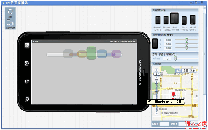
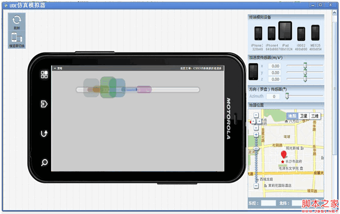
建議開發童鞋使用跨平台開發工具——統一開發環境UDE來 進行查看、調試、開發哦~~它是一款HTML5跨平台一站式應用開發、調試和部署工具, 支持HTML5跨平台開發,原Java跨平台插件支持Android/Symbian/Kjava的跨平台和原生開發,為開發者提供豐富的應用模板、示例 代碼及開發者社區服務,已覆蓋Android、iOS、WP、Symbian、Kjava操作系統平台。
UDE模擬器調試效果圖:
下面就一起來看看該示例的實現代碼吧。完整代碼下載請見附件。
HTML結構代碼
<div class="center">
<ul>
<li>
<div></div>
</li>
<li>
<div></div>
</li>
<li>
<div></div>
</li>
<li>
<div></div>
</li>
<li>
<div></div>
</li>
<li>
<div></div>
</li>
<li>
<div></div>
</li>
</ul>
</div>
CSS樣式代碼
@keyframes bump {
0% {
opacity: 0;
left: 535px;
}
100% {
left: -10px;
opacity: 0;
}
10%, 85% {
opacity: 1;
}
}
@keyframes spin {
0%, 100% {
height: 20px;
top: 50px;
}
50% {
height: 100px;
top: 0;
}
}
body {
background: rgba(0, 0, 0, 0.2);
}
div.center {
text-align: center;
margin-top: 40px;
}
ul {
background-color: rgba(255, 255, 255, 0.4);
position: relative;
display: block;
padding: 0;
margin: auto;
width: 600px;
height: 10px;
list-style: none;
border-radius: 200px;
border: 5px solid rgba(255, 255, 255, 0.2);
margin-top: 100px;
box-shadow: 0 0 5px 5px rgba(0, 0, 0, 0.1);
}
ul li {
position: absolute;
margin-top: -55px;
}
ul li:nth-child(1) {
animation: bump 1.5s infinite;
animation-delay: 0.1s;
}
ul li:nth-child(1) div {
border-radius: 22px;
transform-origin: center;
position: absolute;
height: 60px;
width: 80px;
animation: spin 0.4s infinite;
animation-delay: 0.1s;
background-color: rgba(120, 120, 120, 0.3);
}
ul li:nth-child(2) {
animation: bump 1.5s infinite;
animation-delay: 0.2s;
}
ul li:nth-child(2) div {
border-radius: 22px;
transform-origin: center;
position: absolute;
height: 60px;
width: 80px;
animation: spin 0.4s infinite;
animation-delay: 0.2s;
background-color: rgba(120, 0, 0, 0.3);
}
ul li:nth-child(3) {
animation: bump 1.5s infinite;
animation-delay: 0.3s;
}
ul li:nth-child(3) div {
border-radius: 22px;
transform-origin: center;
position: absolute;
height: 60px;
width: 80px;
animation: spin 0.4s infinite;
animation-delay: 0.3s;
background-color: rgba(120, 120, 0, 0.3);
}
ul li:nth-child(4) {
animation: bump 1.5s infinite;
animation-delay: 0.4s;
}
ul li:nth-child(4) div {
border-radius: 22px;
transform-origin: center;
position: absolute;
height: 60px;
width: 80px;
animation: spin 0.4s infinite;
animation-delay: 0.4s;
background-color: rgba(0, 120, 0, 0.3);
}
ul li:nth-child(5) {
animation: bump 1.5s infinite;
animation-delay: 0.5s;
}
ul li:nth-child(5) div {
border-radius: 22px;
transform-origin: center;
position: absolute;
height: 60px;
width: 80px;
animation: spin 0.4s infinite;
animation-delay: 0.5s;
background-color: rgba(0, 120, 120, 0.3);
}
ul li:nth-child(6) {
animation: bump 1.5s infinite;
animation-delay: 0.6s;
}
ul li:nth-child(6) div {
border-radius: 22px;
transform-origin: center;
position: absolute;
height: 60px;
width: 80px;
animation: spin 0.4s infinite;
animation-delay: 0.6s;
background-color: rgba(0, 0, 120, 0.3);
}
ul li:nth-child(7) {
animation: bump 1.5s infinite;
animation-delay: 0.7s;
}
ul li:nth-child(7) div {
border-radius: 22px;
transform-origin: center;
position: absolute;
height: 60px;
width: 80px;
animation: spin 0.4s infinite;
animation-delay: 0.7s;
background-color: rgba(120, 0, 120, 0.3);
}
注:請自行在所需之處加上浏覽器前綴(如:-webkit- 、 -moz-),否則將不能正常顯示效果。
源碼下載請見附件
DivCSS教程排行
程序編程推薦
相關文章


copyright © 萬盛學電腦網 all rights reserved