您现在的位置: 萬盛學電腦網 >> 程式設計 > >> 網頁製作 >> Div CSS 教學
CSS3 Regions 區域模塊:實現雜誌級排版佈局
背景與動機
印刷媒體(雜誌、報紙)擁有極靈活的多欄、不規則區域排版能力。Web 受限於文檔流線性特性,難以實現類似效果。CSS3 Regions 模塊應運而生:內容流動指定區域,而非綁定特定容器。

核心概念:內容源與區域
- 內容源:包含流動內容的元素,指定
flow-into: <ident> - 區域:接收內容的容器,指定
flow-from: <ident> - 瀏覽器自動將內容按順序填充各區域,超出部分流向下一區域
瀏覽器支援與啟用
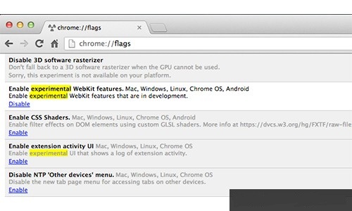
實驗階段,僅 Chrome (需啟用 chrome://flags → "啟用實驗性 WebKit 特性") 和 IE 支援帶前綴屬性。
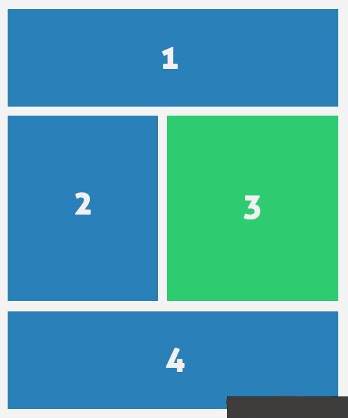
基本用例:主內容穿插側邊欄
HTML 結構
<header class="cf">...</header>
<article class="cf"><p>主要內容...</p></article>
<aside><p><img src="stat.jpg"></p><p>側邊內容...</p></aside>

<div class="regions cf">
  <div id="region-1" class="region cf"></div>
  <div id="region-2" class="region"></div>
  <div id="region-3" class="region"></div>
  <div id="region-4" class="region cf"></div>
</div>
CSS 關鍵樣式
/* 區域尺寸 - 高度必須指定,決定斷點 */#region-1, #region-4 { width: 100%; height: 250px; }
#region-4 { height: 400px; }
#region-2, #region-3 { width: 50%; height: 700px; margin-bottom: 25px; }
/* 內容流向映射 */
article { -webkit-flow-into: article; flow-into: article; }
aside { -webkit-flow-into: aside; flow-into: aside; }
#region-1, #region-2, #region-4 {
-webkit-flow-from: article; flow-from: article;
}
#region-3 {
-webkit-flow-from: aside; flow-from: aside;
}關鍵點:flow-into/flow-from 後的標識符自定義 (如 article, aside),區域在 DOM 中位置不影響流向。

現狀與替代方案
Regions 尚未標準化,生產環境建議考慮:
- CSS Multi-column Layout (多欄佈局)
- CSS Grid / Flexbox 組合
- JavaScript 動態分割內容 (如 columnizer 插件)
- 上一篇程序編程: CSS Box Model 盒屬性詳解與 box-sizing 最佳實踐
- 下一篇程序編程: 寶可夢配色靈感站 Pokepalettes 與 CSS Hover 動畫收藏站
推薦文章
- 修復 IE7 以下版本 LI 內元素錯位的 CSS Hack 技巧
- CSS 概述:從基礎觀念到層疊優先序完整指南
- 建置 Docker 私有倉庫完整實戰:Registry、Nginx、HTTPS、…
- CSS 偽元素實現文字局部變色:單字雙色、漸變、動畫的進階技巧
- CSS3 3D 立方體旋轉動畫完整實現指南:水平、垂直、平面三種模式
- CSS 清除浮動完全指南:BFC 原理、偽元素、Overflow、Flex/Gr…
- 使用 CSS 將 DIV 分為左右兩欄的方法
- IE 專用 CSS Hack 技巧:解決表單元素寬度對齊難題
- CSS 渲染效能優化 11 大鐵律:從選擇器、屬性到繪製層的全方位加速策略
- CSS 組合選擇器詳解:後代、子代、相鄰與群組選擇器的語法與應用
copyright © 萬盛學電腦網 all rights reserved