您现在的位置: 萬盛學電腦網 >> 程式設計 > >> 網頁製作 >> HTML 腳本教學
CSS Sprite 實戰:還原 Google 首頁 Logo 動畫效果
Google 首頁的 Doodle 動畫常讓人驚嘆,其核心技術之一即 CSS Sprite(CSS 精靈圖)。本文通過實戰拆解,示範如何用一張精靈圖 + JavaScript 定時切換 background-position,輕鬆實現幀動畫效果。
核心原理
- 準備兩張圖:初始靜態圖 + 包含所有動畫幀的精靈圖
- HTML 結構:多個同尺寸
<div>疊放在同一位置,僅background-position不同 - JS 邏輯:
setInterval循環切換各<div>的顯示/隱藏,或直接操作單個元素的background-position
實戰步驟
1. 素材準備

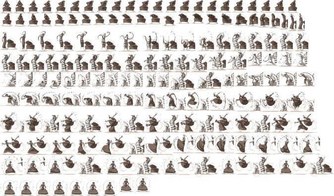
2. 觀察 Google 實際運行的 HTML 結構
通過開發者工具發現,Google 會動態生成類似以下結構:
<div id="hplogo0" style="left:307px;top:48px;width:88px;height:89px;background:url(sprite.png) 0 0 no-repeat;"></div>
<div id="hplogo1" style="left:307px;top:48px;width:89px;height:89px;background:url(sprite.png) -88px 0 no-repeat;"></div>
<div id="hplogo2" style="left:307px;top:48px;width:91px;height:89px;background:url(sprite.png) -177px 0 no-repeat;"></div>
... 共 12 幀 ...
每幀寬高、定位略有差異,對應精靈圖中不同位置。
3. JavaScript 動畫實現(簡化版)
const frames = [
  {x: 0,   w: 88, h: 89, l: 307, t: 48},
  {x: -88, w: 89, h: 89, l: 307, t: 48},
  {x: -177,w: 91, h: 89, l: 307, t: 48},
  {x: -268,w: 93, h: 89, l: 305, t: 49},
  {x: -361,w: 93, h: 88, l: 305, t: 50},
  {x: -454,w: 93, h: 88, l: 305, t: 50},
  {x: -547,w: 92, h: 86, l: 306, t: 52},
  {x: -639,w: 93, h: 84, l: 305, t: 53},
  {x: -732,w: 94, h: 83, l: 305, t: 54},
  {x: -826,w: 93, h: 83, l: 306, t: 54},
  {x: -919,w: 92, h: 83, l: 307, t: 54}
];

const logo = document.getElementById('logo');
let i = 0;
setInterval(() => {
  const f = frames[i];
  logo.style.width = f.w + 'px';
  logo.style.height = f.h + 'px';
  logo.style.left = f.l + 'px';
  logo.style.top = f.t + 'px';
  logo.style.backgroundPosition = f.x + 'px 0';
  i = (i + 1) % frames.length;
}, 100); // 100ms/幀 ≈ 10fps
4. 現代優化寫法:單元素 + steps() 動畫
若精靈圖幀尺寸固定、排列整齊,可直接用 CSS Animation:
@keyframes doodle {
  from { background-position: 0 0; }
  to   { background-position: -1104px 0; } /* 12幀 × 92px */
}
#logo {
  width: 92px; height: 89px;
  background: url(sprite.png) no-repeat;
  animation: doodle 1.2s steps(12) infinite;
}
關鍵點總結
- 精靈圖減少 HTTP 請求,提升加載性能
background-position負值向左/向上偏移- 幀尺寸不一致時需 JS 精確控制尺寸與定位
- 現代瀏覽器優先考慮
steps()純 CSS 方案,性能更優
掌握 Sprite 動畫,不僅能還原 Google Doodle,更能應用於遊戲角色動作、載入圖標、UI 微動效等場景。
- 上一篇程序編程: 前端開發常用 HTML/JS 代碼片段速查手冊
- 下一篇程序編程: JavaScript 正則表達式完全指南:從入門到實戰
推薦文章
- HTML 優化十大技巧:加速網頁載入、降低頻寬與提升執行效能
- 在 XUL 中嵌入 HTML 元素:命名空間、約束與最佳實踐
- 網站建設五大常見 HTML 錯誤與修正指南:從背景色到語義結構
- 正確使用 XHTML 的冒險:application/xhtml+xml 實戰坑…
- HTML select 標籤屬性與方法完整參考指南
- JavaScript 清空 <select> 選項的三種方法與效能比較
- Python 字典鍵存在性判斷:in 操作符 vs has_key() 歷史遺留
- Python 多字符分割字符串:re.findall(r"[\w']+") 提取…
- Python wxPython 實現音頻文件選擇與播放:FileBrowseBu…
- HTML 圖像標籤 `<img>` `<picture>` `<svg>` 完整…
copyright © 萬盛學電腦網 all rights reserved