您现在的位置: 萬盛學電腦網 >> 程式設計 > >> 網頁製作 >> Div CSS 教學
CSS3 border-radius 圓角屬性全解析:從基礎到繪製圖形
語法詳解
/* 縮寫:水平半徑 / 垂直半徑 */
border-radius: 2em 1em 4em / 0.5em 3em;
/* 等價於 */
border-top-left-radius:     2em 0.5em;
border-top-right-radius:    1em 3em;
border-bottom-right-radius: 4em 0.5em;
border-bottom-left-radius:  1em 3em;
無 / 時水平垂直半徑相等。四值順序:左上、右上、右下、左下。
基礎用法與瀏覽器前綴
.round {
  border-radius: 5px;           /* 標準 */
  -moz-border-radius: 5px;      /* Firefox 老版本 */
  -webkit-border-radius: 5px;   /* WebKit 老版本 */
  /* 四角不同半徑 */
  border-radius: 5px 4px 3px 2px;
}
繪製幾何圖形
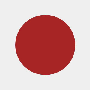
1. 實心圓
寬高相等,半徑 = 寬度/2
#circle {
  width: 200px; height: 200px;
  background: #a72525;
  border-radius: 100px; /* 或 50% */
}
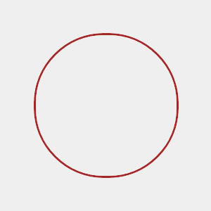
2. 空心圓
邊框寬度 < 寬度/2
#circle {
  width: 200px; height: 200px;
  background: #efefef; /* 或 transparent */
  border: 3px solid #a72525;
  border-radius: 100px;
}
3. 虛線圓
#circle {
  width: 200px; height: 200px;
  background: transparent;
  border: 3px dashed #a72525;
  border-radius: 100px;
}
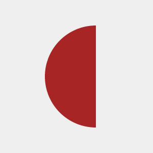
4. 半圓
寬 = 高/2,僅左側兩角圓角 = 高度
#semicircle {
  width: 100px; height: 200px;
  background: #a72525;
  border-radius: 200px 0 0 200px; /* 或 100px 0 0 100px 視方向 */
}
5. 四分之一圓 (扇形)
寬高相等,單角圓角 = 寬度
#quarter {
  width: 200px; height: 200px;
  background: #a72525;
  border-radius: 200px 0 0 0; /* 左上角 */
}
進階組合圖形
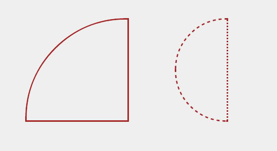

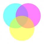
- 虛線半圓/扇形:
border-style: dashed配合單側圓角 - 月亮:兩個半圓絕對定位疊加,利用
z-index控制遮擋 - 文氏圖:三圓
position: absolute疊加 +rgba()半透明 +z-index分層
現代最佳實踐
- 優先使用
border-radius: 50%製作圓形,自適應容器尺寸 - 配合
clip-path實現更複雜非矩形裁剪 - 動畫過渡:
transition: border-radius .3s可平滑變形 - 性能:大量圓角元素考慮
will-change: border-radius或改用 SVG
推薦文章
- CSS 派生選擇器 (後代組合器) 完整語法與語意化架構應用
- CSS 網頁渲染效能優化 11 大實戰技巧
- 騰訊手機 QQ 遊戲大廳發布 HTML5 版:歡樂鬥地主登陸 iPad
- 深入理解 CSS clip 屬性:元素裁切的實戰指南
- CSS3 :target 偽類實現無 JavaScript 頁籤切換:錨點連結控…
- CSS 外部樣式表引用方式詳解:link vs @import
- CSS 文字自動換行完全指南:兼容中英文混排與跨瀏覽器方案
- CSS 組合選擇器詳解:後代、子代、相鄰與群組選擇器的語法與應用
- CSS 命名規範實務:BEM 變體、語意化、縮寫對照表與狀態類
- CSS選擇器完全指南:從基礎到CSS3/4級選擇器、效能排序與工程化最佳實踐
copyright © 萬盛學電腦網 all rights reserved