您现在的位置: 萬盛學電腦網 >> 程式設計 > >> 網頁製作 >> Div CSS 教學
CSS3 Gradient 漸變詳解:線性、徑向、重複漸變完整語法
兩大漸變類型
- linear-gradient:線性漸變,沿直線方向
- radial-gradient:徑向漸變,從中心點向四周輻射
各自有 repeating- 變體實現重複模式。
線性漸變語法演進
WebKit 早期語法 (舊)
-webkit-gradient(linear, left top, left bottom,
  from(#FD0), color-stop(0.5, #F80), to(#C30))
標準語法 (現代)
linear-gradient([  | to  ]?, )
/* 方向關鍵字 */
to top | to bottom | to left | to right
to top left | to top right | to bottom left | to bottom right
/* 角度 */
45deg | -90deg | 0.5turn
瀏覽器前綴
background: -webkit-linear-gradient(top, #FD0, #C30);
background: -moz-linear-gradient(top, #FD0, #C30);
background: -o-linear-gradient(top, #FD0, #C30);
background: linear-gradient(to bottom, #FD0, #C30); /* 標準寫法最後 */
線性漸變實例
基本雙色漸變
background: linear-gradient(top, #eff6fb, #d3e4f3 68%);
多色停靠點 (彩虹漸變)
background: linear-gradient(left,
  #FF0000, #FFA500 13%, #FFFF00 26%,
  #0000FF 39%, #008000 52%, #4B0082 65%, #EE82EE 78%);
方向關鍵字與角度
/* 關鍵字 */
background: linear-gradient(top left, #eff6fb 10%, #d3e4f3 68%);
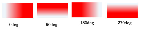
 /* 角度:0deg=左→右, 90deg=下→上, 180deg=右→左, 270deg=上→下 */
background: linear-gradient(45deg, #eff6fb 10%, #d3e4f3 68%);
透明漸變 (疊加背景圖)
background:
  linear-gradient(to bottom, rgba(255,255,255,0), rgba(255,255,255,1)),
  url(pattern.png);
徑向漸變語法
radial-gradient([  ||  ]? [ at  ]?, )
/* 形狀 */ circle | ellipse
/* 尺寸 */ closest-side | farthest-corner | contain | cover |  |
/* 位置 */ center | top left | 50% 50% | 100px 100px
基本用法
/* 預設橢圓、中心、farthest-corner */
background: radial-gradient(red, yellow, #1E90FF);
 /* 指定色標位置 */
background: radial-gradient(red 5%, yellow 25%, #1E90FF 50%);
 /* 形狀與位置 */
background: radial-gradient(bottom left, circle, red, yellow, #1E90FF);
background: radial-gradient(bottom left, ellipse, red, yellow, #1E90FF);

尺寸關鍵字示意
closest-side:最近邊緣farthest-corner(預設):最遠角落contain= closest-side,cover= farthest-corner
重複漸變
/* 重複徑向:同心圓環 */
background: repeating-radial-gradient(black, black 5px, white 5px, white 10px);

/* 重複線性:斜條紋 */
background: repeating-linear-gradient(-45deg, red, red 5px, white 5px, white 10px);
現代最佳實踐
- 使用標準語法 + Autoprefixer 自動添加前綴
- 複雜漸變用
background-image而非background避免重置其他屬性 - 漸變作為背景圖時配合
background-size、background-position精確控制 - 性能考量:大面積複雜漸變考慮生成圖片或 Canvas 替代
- 上一篇程序編程: CSS3 opacity 透明度屬性完整指南與 RGBA 對比
- 下一篇程序編程: CSS3 border-radius 圓角屬性全解析:從基礎到繪製圖形
推薦文章
- CSS3 RGBA 設定透明色完整指南
- Div 容器高度自適應:CSS 實現自動調整高度的多種方案
- 解決 img 圖片底部多餘空白間隙的 6 種方案
- CSS 可維護架構:從可讀、可維護、可擴展到可復用的實戰思維
- Div+CSS 選擇器分組技巧:逗號合併共同樣式減少重複代碼
- CSS 文字自動換行完全指南:兼容中英文混排與跨瀏覽器方案
- CSS 樣式化標題實戰:從基礎字體到裝飾邊框
- CSS 命名規範三大流派:駝峰、下劃線、匈牙利/帕斯卡 深度解析
- CSS 樣式化 input 元素完整避坑指南:高度、垂直置中、字體繼承
- Struts2 checkboxlist 標籤 cssClass 屬性不生成 c…
copyright © 萬盛學電腦網 all rights reserved