您现在的位置: 萬盛學電腦網 >> 程式設計 > >> 網頁製作 >> Div CSS 教學
CSS 純代碼繪製三角箭頭實戰:原理、兼容與應用模式
核心原理:Border 三角形幾何
元素寬高為 0,四邊框寬度相等時形成四個三角形拼接的正方形。透過設置三邊透明、一邊有色,即得單一方向三角形。
演示過程
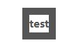
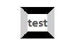

保留上邊框色,其餘設透明 → 向下三角形:

四方向控制:

基礎代碼模板
.arrow {
  float: left;
  width: 0; height: 0; font-size: 0; line-height: 0;
  border-style: solid; border-width: 10px;
  border-color: #000 transparent transparent transparent; /* 向下 */
}
/* 向上 */ border-color: transparent transparent #000 transparent;
/* 向左 */ border-color: transparent #000 transparent transparent;
/* 向右 */ border-color: transparent transparent transparent #000;
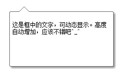
實戰應用:帶箭頭的提示框 (含 IE6 兼容)
HTML
<div class="demo">
  <div class="content">動態內容,高度自適應</div>
  <b class="bottom-arrow"></b>
</div>
CSS
.demo { position: relative; }
.content {
  position: relative; z-index: 1;
  border: 1px solid #666; border-radius: 3px;
  background: #fff; padding: 5px;
  box-shadow: 3px 3px 4px #999;
  /* IE 陰影濾鏡 */
  filter: progid:DXImageTransform.Microsoft.Shadow(Strength=4, Direction=135, Color='#999999');
  -ms-filter: "progid:DXImageTransform.Microsoft.Shadow(Strength=4, Direction=135, Color='#999999')";
}
.bottom-arrow {
  position: absolute; top: 10px; left: 20px;
  width: 0; height: 0; font-size: 0; line-height: 0;
  border-style: solid; border-width: 10px;
  border-color: #000 transparent transparent transparent;
  /* IE6 透明邊框 hack */
  _border-color: #000 tomato tomato tomato;
  _filter: chroma(color=tomato);
}
IE6 透明邊框 Hack 詳解
- IE6 不支援
transparent關鍵字 - 指定一個不會用到的顏色 (如
tomato) 作為透明色佔位 filter: chroma(color=tomato)將該顏色設為透明- 現代項目可完全移除此 hack
現代優化方案
- 使用
::before/::after偽元素替代額外 HTML 標籤 - 配合
transform: rotate(45deg)實現更靈活角度 - SVG 或 CSS
clip-path: polygon(...)繪製複雜箭頭 - 動畫過渡:
transition: border-color .2s, transform .2s
- 上一篇程序編程: CSS3 Regions 區域佈局模塊深度解析:內容流動、形狀環繞與區域樣式
- 下一篇程序編程: CSS 選擇器完全指南:從基礎到進階的 44 種選擇器分類詳解
推薦文章
- CSS 替換元素與非替換元素、塊級與行內元素完整分類指南
- DRY CSS 方法論:以邏輯分組重構樣式,實現 HTML 語義化與 CSS 解…
- CSS 字體屬性完整參考手冊:從基礎到進階應用
- 純 CSS 繪製三角形箭頭:零圖片、全瀏覽器相容的實作技巧
- 《跟我學 HTML+CSS》圖書詳情:全元素屬性詳解、經典實例、商業案例實戰
- 破解 IE6/IE7 不支援 display:inline-block 的 ha…
- IE 中嵌入視頻遮擋 DIV 層的解決方案:windowlessVideo 屬性…
- CSS 命名規範實戰:語意化、可維護、避開常見陷阱
- CSS 網頁背景完整控制指南:顏色、圖片、重複、定位、固定、簡寫
- CSS 預設字體樣式最佳實踐:字體選擇、大小、行高與效能優化
copyright © 萬盛學電腦網 all rights reserved