您现在的位置: 萬盛學電腦網 >> 程式設計 > >> 網頁製作 >> Div CSS 教學
CSS 圓角矩形五大經典技巧:從固定寬度到滑動門與山頂角
前言:圓角技術的演進
CSS2 無原生圓角邊框(border-radius 為 CSS3 新增),設計師長期依賴圖片拼接技巧。這些技巧雖屬「經典」,但其核心思維——「以有限資源組合出無限變化」——至今仍具啟發價值。
技巧一:固定寬度純色圓角矩形(兩圖法)
適用場景:寬度固定、高度自適應、單一背景色。
結構:
<div class="wrapper">
  <h1>標題</h1>
  <p>內容</p>
</div>圖片:top.gif(左上圓角)、bottom.gif(左下圓角),寬度等於容器寬度,背景色與容器一致。
CSS:
.wrapper {
  width: 181px; /* 圖片實際寬度 */
  background: #8cc355 url(bottom.gif) no-repeat left bottom;
}
.wrapper h1 {
  padding: 10px 20px 0 20px;
  background: url(top.gif) no-repeat left top;
}
.wrapper p {
  padding: 0 20px 10px 20px;
}


技巧二:固定寬度非純色圓角(三圖法)
延伸自技巧一,將容器背景色改為垂直重複的圖片 tile.gif。
.wrapper {
  width: 183px;
  background: url(tile.gif) repeat-y center;
}
.wrapper h1 {
  padding: 20px 20px 0 20px;
  background: url(top.gif) no-repeat left top;
}
.wrapper p {
  padding: 0 20px 20px 20px;
  background: url(bottom.gif) no-repeat left bottom;
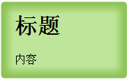
}


限制:不適用於垂直方向背景變化的圖案。
技巧三:滑動門技術——雙向自適應圓角
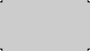
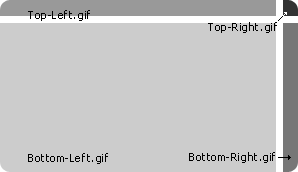
核心原理:使用四張大圖(左上、右上、左下、右下),透過背景定位讓右側圖片隨寬度滑動、下側圖片隨高度滑動。
圖片結構:
HTML:需額外兩層無語義標籤(.box-outer、.box-inner)。
<div class="wrapper">
  <div class="box-outer">
    <div class="box-inner">
      <h1>標題</h1>
      <p>內容</p>
    </div>
  </div>
</div>CSS:
.wrapper {
  width: 20em;
  background: #ccc url(bottom-left.gif) no-repeat left bottom;
}
.box-outer  { background: url(bottom-right.gif) no-repeat right bottom; }
.box-inner  { background: url(top-left.gif)    no-repeat left top; }
.wrapper h1 { padding: 2%; background: url(top-right.gif) no-repeat right top; }
.wrapper p { padding: 2%; }優點:完美解決雙向自適應。
缺點:需額外標籤、容器最大尺寸受限於圖片尺寸。可用 JS 動態插入標籤改善語意。
技巧四:山頂角——單一蒙板組生成多色圓角
Dan Cederholm 發明。不製作多色圖片組,而是建立透明圓角蒙板(PNG-24 或 GIF),蓋在純色背景上。
優點:一組蒙板支援任意背景色。
缺點:IE6 不支援 PNG-24 透明(需 Hack)、GIF 大圓角有鋸齒、仍需額外標籤。
技巧五:CSS Sprites 圓角
將四個圓角合併為一張圖,透過 background-position 定位。雖減少 HTTP 請求,但需大量無語義標籤定位,維護性較差,不推薦作為通用方案。

現代最佳實踐
今日專案請直接使用 border-radius:
.rounded {
  border-radius: 8px;           /* 標準 */
  -webkit-border-radius: 8px;   /* 舊版 WebKit */
  -moz-border-radius: 8px;      /* 舊版 Firefox */
}
僅在需支援極舊瀏覽器(IE8 以下)時,才考慮上述圖片技巧或 behavior: url(PIE.htc) 等 Polyfill。
- 上一篇程序編程: CSS @media screen 媒體類型:打造固定工具列的關鍵技巧
- 下一篇程序編程: CSS overflow 隱藏陷阱:自動聚焦與中鍵失效的跨瀏覽器差異
推薦文章
- overflow: hidden 深度解析:從隱藏溢出到清除浮動的 BFC 原理
- CSS 多欄佈局避坑:內邊距、邊框導致欄位下掉的解決方案
- CSS 繼承機制深度解析:哪些屬性可繼承、舊版瀏覽器陷阱與修正策略
- CSS 遮罩層完美兼容方案:IE6-IE9、Firefox、Chrome 全支援
- CSS 讓圖片自適應 Div 寬度(含 Expression 即時縮放)
- CSS子選擇器(>)與後代選擇器(空格)深度對比與高效應用指南
- CSS/DIV+CSS 視頻教程介紹:從表格佈局邁向 Web 標準化架構
- CSS3 純樣式打造 Ajax Loading 動畫:transform + a…
- CSS 空格處理與大小寫規則:white-space 屬性、編碼規範與跨瀏覽器實…
- 深度解析:DIV+CSS vs Table 建站——三大宣稱優勢的現實檢視與最佳…
copyright © 萬盛學電腦網 all rights reserved