您现在的位置: 萬盛學電腦網 >> 程式設計 > >> 網頁製作 >> Div CSS 教學
CSS @media screen 媒體類型:打造固定工具列的關鍵技巧
為什麼 screen 媒體類型常被忽視?
@media 規則能針對不同輸出裝置套用樣式。print 媒體廣為人知(列印樣式),但 screen 常被視為「預設呈現」而未被充分利用。實際上,在絕對定位佈局中,screen 媒體類型具有關鍵意義。
實戰場景:固定底部工具列的滾動難題
開發 Ajax Web 應用時,需在螢幕固定位置建立介面元件(如橫跨底部的工具列)。常見做法:
- 使用
<iframe>或<div>配合position: fixed。 - 但框架會犧牲應用簡潔性,且降低客戶端 ECMAScript 控制
<div>可視性的能力。
最佳方案:純 CSS 實現固定定位佈局。
玩具級文件檢視器範例
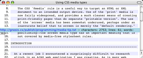
目標:建立類似圖 1 的介面——頂部內容區可捲動,底部工具列固定。

HTML 模板
<html>
<head><title>Using CSS media types</title> @CSS </head>
<body>
  <div class="top"> @ITEMS </div>
  <div class="bottom"> @SUMMARY </div>
</body>
</html>
初始 CSS(未解決滾動問題)
div.bottom {
  background-color: lightblue;
  position: absolute;
  bottom: 0; left: 0; right: 0;
  height: 20px;
}
div.top { background-color: white; }
li.odd  { background-color: #EAEAFF; }
li.even { background-color: #FCFCFC; }
此時向下捲動 .top 區塊時,工具列會被內容遮蓋(見圖 2)。
利用 @media screen 修正固定定位
關鍵在於針對螢幕媒體套用 position: fixed,而列印媒體保持預設流式佈局:
@media screen {
  div.bottom {
    position: fixed;
    bottom: 0; left: 0; right: 0;
  }
  div.top {
    margin-bottom: 20px; /* 為固定底部預留空間 */
  }
}

@media print {
  div.bottom { position: static; }
  div.top    { margin-bottom: 0; }
}
此做法確保:
- 螢幕瀏覽:工具列固定底部,內容區獨立捲動。
- 列印輸出:工具列回歸文件流,避免重疊列印內容。
核心觀念總結
screen媒體類型非單純「預設」,而是「互動式視覺裝置」的精準標識。- 結合
@media screen與position: fixed,可在不使用框架、不依賴 JS 的情況下實現穩固的固定定位 UI。 - 同樣的 CSS 規則,透過媒體查詢區隔,能同時滿足螢幕閱讀與列印輸出的不同需求。
- 上一篇程序編程: IE 瀏覽器引入 CSS 樣式表的限制與突破方案
- 下一篇程序編程: CSS 圓角矩形五大經典技巧:從固定寬度到滑動門與山頂角
推薦文章
- CSS Hack 完全指南:瀏覽器兼容性解決方案、選擇器 Hack、屬性前綴與現…
- CSS Filter + Transform 實現懸停漸變翻轉卡片效果
- CSS 常見技巧與瀏覽器兼容處理 11 招:間隙、超連結、捲軸、截斷、換行、Fl…
- 滑鼠進入/離開切換 CSS 樣式:原生 JS 實現 Hover 狀態控制教學
- CSS ID 選擇器特性:唯一性命名與單一元素樣式指定
- CSS 實現表單文字方框滑鼠游標自動聚焦並全選
- CSS 渲染效能優化 11 條鐵律:從選擇器到繪製
- CSS 長度單位深度比較:px 絕對像素、em 相對父層、rem 相對根元素的換…
- CSS 相對定位深度解析:原理、行為邊界、實戰模式與常見誤區
- CSS 註釋進階技法:準修飾、標籤系統與繼承標記
copyright © 萬盛學電腦網 all rights reserved