您现在的位置: 萬盛學電腦網 >> 程式設計 > >> 網頁製作 >> Div CSS 教學
CSS clip 屬性打造雙色文字特效:遮罩剪裁原理實作
核心原理
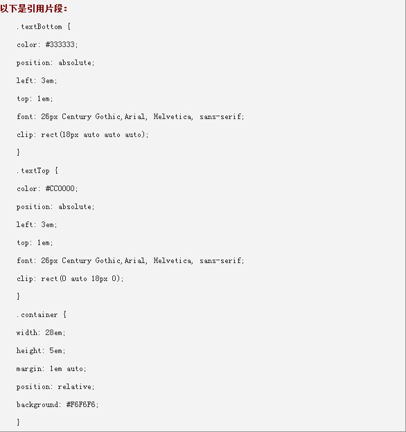
疊放兩層相同文字、不同顏色,分別套用 clip: rect(...) 剪裁不同區域,形成雙色/多色文字效果。

測試環境
Firefox 1.5、IE 6.0、Opera 8.5、IE 5.01 綠色版通過。
CSS 代碼
.text-top {
  position: absolute;
  top: 0; left: 0;
  color: #ff0000;          /* 上半部顏色 */
  clip: rect(0, 200px, 12px, 0); /* 裁切上半部 */
  /* rect(top, right, bottom, left) */
}

.text-bottom {
  position: absolute;
  top: 0; left: 0;
  color: #0000ff;          /* 下半部顏色 */
  clip: rect(12px, 200px, 24px, 0); /* 裁切下半部 */
}
XHTML 結構
<div class="text-container">
  <span class="text-top">雙色文字效果</span>
  <span class="text-bottom">雙色文字效果</span>
</div>
clip 屬性詳解
clip: rect(top, right, bottom, left);- 僅對
position: absolute/fixed元素生效。 - 四值順序:上、右、下、左(順時針)。
- 單位:px(CSS2.1 不支援 %、em)。
auto表示不裁切該邊。
現代替代方案
clip 已棄用,現代請使用 clip-path:
.text-top {
  clip-path: inset(0 0 50% 0);   /* 保留上半部 */
}
.text-bottom {
  clip-path: inset(50% 0 0 0);   /* 保留下半部 */
}
或使用 background-clip: text + 漸層實現更豐富的文字填色:
.gradient-text {
  background: linear-gradient(red, blue);
  -webkit-background-clip: text;
  background-clip: text;
  color: transparent;
}推薦文章
copyright © 萬盛學電腦網 all rights reserved