您现在的位置: 萬盛學電腦網 >> 程式設計 > >> 網頁製作 >> Div CSS 教學
CSS Animation 動畫屬性完全指南:從關鍵幀到事件監聽的實戰詳解
CSS Animation 讓聲明式動畫成為可能,無需 JavaScript 即可實現複雜序列動畫。本文系統梳理 8 大子屬性語法、3 大事件接口,並提供可直接運行的完整示例。
八大核心子屬性
| 屬性 | 作用 | 關鍵值 |
|---|---|---|
animation-name | 綁定 @keyframes 名稱 | none | custom-name |
animation-duration | 單次動畫時長 | <time> (s/ms),默認 0 |
animation-timing-function | 緩動曲線 | ease/linear/ease-in/out/in-out/cubic-bezier() |
animation-delay | 延遲啟動 | <time>,默認 0 |
animation-iteration-count | 循環次數 | <number> | infinite,默認 1 |
animation-direction | 播放方向 | normal | alternate | reverse | alternate-reverse |
animation-fill-mode | 執行前後狀態 | none | forwards | backwards | both |
animation-play-state | 播放狀態控制 | running | paused |
@keyframes 關鍵幀定義
/* 百分比形式(推薦,支援中間態) */
@keyframes color-change {
  0%   { background: red; }
  25%  { background: green; }
  50%  { background: blue; }
  100% { background: red; }
}

/* from/to 形式(簡單兩態) */
@keyframes fade-in {
  from { opacity: 0; }
  to   { opacity: 1; }
}
簡寫屬性 animation
.demo {
  animation: color-change 1s linear 0s 3 alternate both;
  /* name duration timing delay count direction fill-mode */
}
動畫事件接口:精準控制 JS 交互
三大原生事件(需廠商前綴兼容):
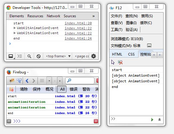
animationstart/webkitAnimationStart:動畫開始animationiteration/webkitAnimationIteration:每次循環結束(含首次)animationend/webkitAnimationEnd:動畫完全結束
事件對象 包含 animationName、elapsedTime 等屬性,可識別具體動畫與已運行時間。
完整可運行示例
<style>
@keyframes test {
  0% { background: red; }
  25% { background: green; }
  50% { background: blue; }
  100% { background: red; }
}
</style>
<script>
document.addEventListener('DOMContentLoaded', () => {
  const html = document.documentElement;
  const log = (e) => console.log(e.type, e.animationName, e.elapsedTime);

  ['animationstart','webkitAnimationStart'].forEach(evt =>
    html.addEventListener(evt, log));
  ['animationiteration','webkitAnimationIteration'].forEach(evt =>
    html.addEventListener(evt, log));
  ['animationend','webkitAnimationEnd'].forEach(evt =>
    html.addEventListener(evt, log));

  // 觸發動畫:3次循環,每次1秒
  html.style.animation = 'test 1s linear 0s 3';
});
</script>
實戰最佳實踐
- 性能優先:僅動畫
transform、opacity、filter觸發合成器層,避免佈局抖動 - will-change:提前告知瀏覽器
will-change: transform, opacity - 減少動畫:尊重
@media (prefers-reduced-motion: reduce)關閉非必要動畫 - 事件解綁:動畫結束後移除監聽器,防止記憶體洩漏
CSS Animation 讓動畫脫離 JS 主線程,在合成器線程高效運行。掌握屬性組合與事件控制,即可構建流暢、可維護、可交互的動畫體驗。
推薦文章
- DIV+CSS 秘籍大全:從入門到精通的進階主題導覽
- CSS 優先序與層疊機制完解:Specificity、重要性、繼承、來源順序實戰…
- 第四天:縱向導航菜單與二級彈出菜單實戰
- CSS 實現帶三角箭頭的提示框 (Tooltip)
- 觸屏設備上 CSS :hover 失效問題與 :active 替代方案
- CSS3 Flexible Box Module(Flexbox 前身)深度解析…
- Web 頁面效能優化:減少 DOM、CSS、JS、圖片對記憶體與 CPU 佔用的…
- CSS 外邊距合併原理剖析:只要接觸就合併,盒模型關鍵概念
- 網頁大圖片寬度控制策略:防止撐破佈局的三大方案
- HTML 標籤入門:標題、段落、連結、圖片核心標籤實戰
copyright © 萬盛學電腦網 all rights reserved