萬盛學電腦網 >> 網頁制作 >> DivCSS教程 >> CSS3圖片旋轉特效(360/60/-360度)
CSS3圖片旋轉特效(360/60/-360度)
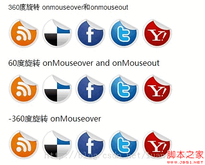
CSS3讓圖片旋轉360度、60度、-360度等,大家可以舉一反三,下面由這幾個度數的示例代碼,喜歡的朋友可以參考下
由於沒法展示效果只是截了個圖
下面是實現代碼:
<style>
p#socialicons img{ /* 1st set of icons. Rotate them 360deg onmouseover and out */
-moz-transition: all 0.8s ease-in-out;
-webkit-transition: all 0.8s ease-in-out;
-o-transition: all 0.8s ease-in-out;
-ms-transition: all 0.8s ease-in-out;
transition: all 0.8s ease-in-out;
}
p#socialicons img:hover{
-moz-transform: rotate(360deg);
-webkit-transform: rotate(360deg);
-o-transform: rotate(360deg);
-ms-transform: rotate(360deg);
transform: rotate(360deg);
}
p#socialicons2 img{ /* 2nd set of icons. Rotate them 60deg onmouseover and out */
-moz-transition: all 0.2s ease-in-out;
-webkit-transition: all 0.2s ease-in-out;
-o-transition: all 0.2s ease-in-out;
-ms-transition: all 0.2s ease-in-out;
transition: all 0.2s ease-in-out;
}
p#socialicons2 img:hover{
-moz-transform: rotate(70deg);
-webkit-transform: rotate(70deg);
-o-transform: rotate(70deg);
-ms-transform: rotate(70deg);
transform: rotate(70deg);
}
p#socialicons3 img{ /* 3rd set of icons. Rotate them -360deg onmouseover ONLY. Note where the "transition prop is added */
}
p#socialicons3 img:hover{
-moz-transition: all 0.5s ease-in-out;
-webkit-transition: all 0.5s ease-in-out;
-o-transition: all 0.5s ease-in-out;
-ms-transition: all 0.5s ease-in-out;
transition: all 0.5s ease-in-out;
-moz-transform: rotate(-360deg);
-webkit-transform: rotate(-360deg);
-o-transform: rotate(-360deg);
-ms-transform: rotate(-360deg);
transform: rotate(-360deg);
}
</style>
<b>360度旋轉 onmouseover和onmouseout</b></p>
<p id="socialicons">
<a href="#">
<img border="0" src="http://www.zzsck.org/wp-content/uploads/2013/10/rss.png" _fcksavedurl=""http://www.zzsck.org/wp-content/uploads/2013/10/rss.png"" /></a>
<a href="#">
<img border="0" src="http://www.zzsck.org/wp-content/uploads/2013/10/delicious.png" /></a>
<a href="#">
<img border="0" src="http://www.zzsck.org/wp-content/uploads/2013/10/facebook.png" /></a>
<a href="#">
<img border="0" src="http://www.zzsck.org/wp-content/uploads/2013/10/twitter.png" /></a>
<a href="#">
<img border="0" src="http://www.zzsck.org/wp-content/uploads/2013/10/yahoo.png" /></a>
</p>
<p><b>60度旋轉 onMouseover and onMouseout</b></p>
<p id="socialicons2">
<a href="#">
<img border="0" src="http://www.zzsck.org/wp-content/uploads/2013/10/rss.png" /></a>
<a href="#">
<img border="0" src="http://www.zzsck.org/wp-content/uploads/2013/10/delicious.png" /></a>
<a href="#">
<img border="0" src="http://www.zzsck.org/wp-content/uploads/2013/10/facebook.png" /></a>
<a href="#">
<img border="0" src="http://www.zzsck.org/wp-content/uploads/2013/10/twitter.png" /></a>
<a href="#">
<img border="0" src="http://www.zzsck.org/wp-content/uploads/2013/10/yahoo.png" /></a>
</p>
<p><b>-360度旋轉 onMouseover</b></p>
<p id="socialicons3">
<a href="#">
<img border="0" src="http://www.zzsck.org/wp-content/uploads/2013/10/rss.png" /></a>
<a href="#">
<img border="0" src="http://www.zzsck.org/wp-content/uploads/2013/10/delicious.png" /></a>
<a href="#">
<img border="0" src="http://www.zzsck.org/wp-content/uploads/2013/10/facebook.png" /></a>
<a href="#">
<img border="0" src="http://www.zzsck.org/wp-content/uploads/2013/10/twitter.png" /></a>
<a href="#">
<img border="0" src="http://www.zzsck.org/wp-content/uploads/2013/10/yahoo.png" /></a>
</p>
DivCSS教程排行
相關文章


copyright © 萬盛學電腦網 all rights reserved