萬盛學電腦網 >> 網頁制作 >> 腳本Html教程 >> html元素水平居中、垂直居中、水平垂直居中於其父級元素的方法
html元素水平居中、垂直居中、水平垂直居中於其父級元素的方法
html元素 水平居中 於 其父級元素的方法:
方法1:
代碼如下:
<div class="wrap">
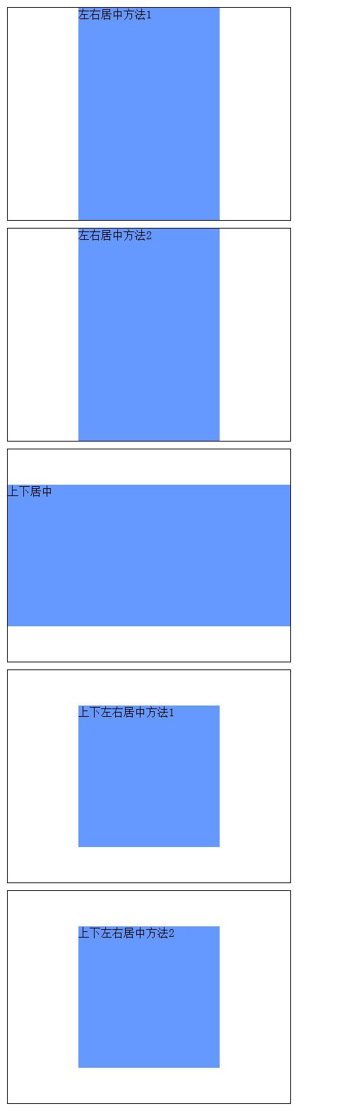
<div class="left-right-middle1">左右居中方法1</div>
</div>
代碼如下:
html,body,div{
margin:0;
padding:0;
height:100%;
position:relative;
}
.wrap{
width:400px;
height:300px;
margin:10px;
border:1px solid #000;
}
.left-right-middle1{
width:200px;
background-color:#69F;
margin:0 auto;
}
方法2:
代碼如下:
<div class="wrap">
<div class="left-right-middle2">左右居中方法2</div>
</div>
代碼如下:
html,body,div{
margin:0;
padding:0;
height:100%;
position:relative;
}
.wrap{
width:400px;
height:300px;
margin:10px;
border:1px solid #000;
}
.left-right-middle2{
width:200px;
background-color:#69F;
left:50%;
margin-left:-100px;
}
html元素 垂直居中 於 其父級元素的方法:
<div class="wrap">
<div class="top-bottom-middle">上下居中</div>
</div>
代碼如下:
html,body,div{
margin:0;
padding:0;
height:100%;
position:relative;
}
.wrap{
width:400px;
height:300px;
margin:10px;
border:1px solid #000;
}
.top-bottom-middle{
height:200px;
background-color:#69F;
top:50%;
margin-top:-100px;
}
html元素 水平垂直居中 於 其父級元素的方法:
方法1:
代碼如下:
<div class="wrap">
<div class="all-middle1">上下左右居中方法1</div>
</div>
代碼如下:
html,body,div{
margin:0;
padding:0;
height:100%;
position:relative;
}
.wrap{
width:400px;
height:300px;
margin:10px;
border:1px solid #000;
}
.all-middle1{
width:200px;
height:200px;
background-color:#69F;
top:50%;
margin:-100px auto 0;
}
方法2:
<div class="wrap">
<div class="all-middle2">上下左右居中方法2</div>
</div>
代碼如下:
html,body,div{
margin:0;
padding:0;
height:100%;
position:relative;
}
.wrap{
width:400px;
height:300px;
margin:10px;
border:1px solid #000;
}
.all-middle2{
width:200px;
height:200px;
background-color:#69F;
top:50%;
left:50%;
margin:-100px 0 0 -100px;
}
完整代碼:
<!DOCTYPE html PUBLIC "-//W3C//DTD XHTML 1.0 Transitional//EN" "http://www.w3.org/TR/xhtml1/DTD/xhtml1-transitional.dtd">
<html xmlns="http://www.w3.org/1999/xhtml">
<head>
<meta http-equiv="Content-Type" content="text/html" charset="utf-8" />
<title>Div Middle</title>
<style type="text/css">
html,body,div{
margin:0;
padding:0;
height:100%;
position:relative;
}
.wrap{
width:400px;
height:300px;
margin:10px;
border:1px solid #000;
}
.left-right-middle1{
width:200px;
background-color:#69F;
margin:0 auto;
}
.left-right-middle2{
width:200px;
background-color:#69F;
left:50%;
margin-left:-100px;
}
.top-bottom-middle{
height:200px;
background-color:#69F;
top:50%;
margin-top:-100px;
}
.all-middle1{
width:200px;
height:200px;
background-color:#69F;
top:50%;
margin:-100px auto 0;
}
.all-middle2{
width:200px;
height:200px;
background-color:#69F;
top:50%;
left:50%;
margin:-100px 0 0 -100px;
}
</style>
</head>
<body>
<div class="wrap">
<div class="left-right-middle1">左右居中方法1</div>
</div>
<div class="wrap">
<div class="left-right-middle2">左右居中方法2</div>
</div>
<div class="wrap">
<div class="top-bottom-middle">上下居中</div>
</div>
<div class="wrap">
<div class="all-middle1">上下左右居中方法1</div>
</div>
<div class="wrap">
<div class="all-middle2">上下左右居中方法2</div>
</div>
</body>
</html>
效果圖:
腳本Html教程排行
程序編程推薦
相關文章


copyright © 萬盛學電腦網 all rights reserved