萬盛學電腦網 >> 網頁制作 >> 交互設計 >> 數據之美(六):美不勝收的數據圖(下)
數據之美(六):美不勝收的數據圖(下)
這是《數據之美》系列的第六篇,本文搜集了更多令人歎為觀止的數據圖(Infographics),展示了那些原本枯燥的數據,在轉換為可視化圖表 之後令人目不暇接的美麗。
Mapping prep 2

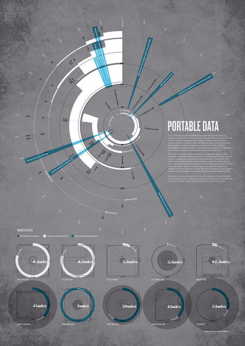
Storage10
Digital Media Weights and Measures

Codes of Design

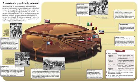
Editora Moderna
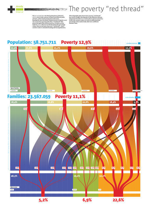
Italians social condition – Poverty -
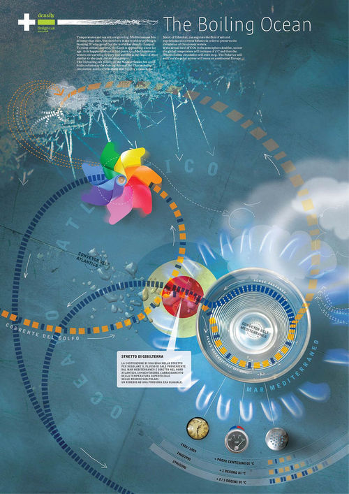
Flickr Photo Download: Boiling Ocean
Geological time spiral

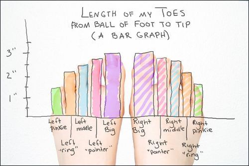
(285) Length of My Toes, From Ball of Foot to Tip (A Bar Graph)
data visualisation with processing
Planets
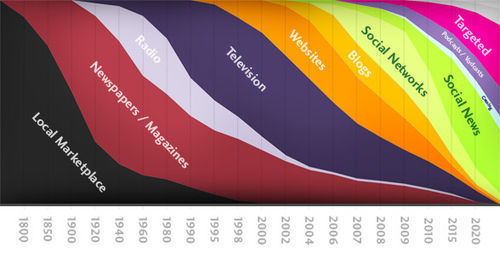
Where is Everyone?
Haga clic para continuar
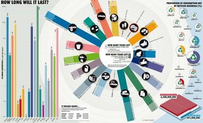
Cool Infographics: How Long Will It Last?
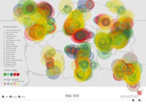
One week of earthquakes (showing hypocentric depth)

Dear Gretchen
Beatles Infographics

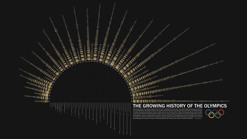
Olympics_colorTIGHT1
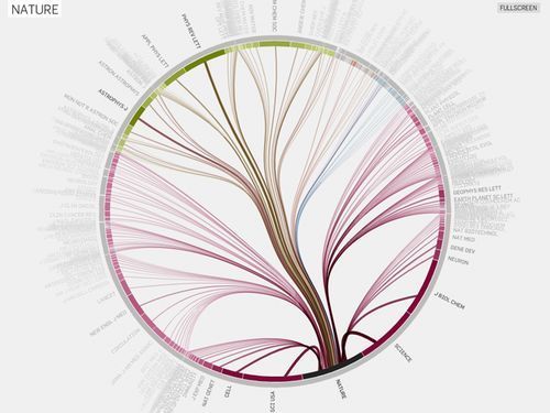
NATURE
Frederick Engels Biography

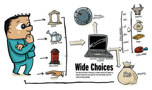
Wide Choices
Complex Data Visualization
The Medal is a World

Crisis has toppled some of the world’s major economies

Cost of Ownership

Forever Young

Fifty Years of Exploration

The Big Questions of Climate Change

How Long Will It Last?

The Killing of Puerto Hurraco

Lord of the Gorillas

Which Professionals Are Happiest?

The Feltron 2008 Atlas

Expiry Date

Infographic: Park Ranger Handbook


