萬盛學電腦網

 萬盛學電腦網 >> 圖文處理 >> 平面設計理論 >> 那些年,我們一起追過的字體

那些年,我們一起追過的字體

   我想不少設計師在學生時代都有自己心目中的“沈佳宜”,她不一定那麼漂亮,卻又自己的風格,總有種“眾裡尋他千百度,蓦然回首,那人卻在燈火闌珊處”的趕腳。

  年歲漸長,當年的毛頭小子變成了設計行業的精英,這時候你心目中一定還有一個沈佳宜!只不過…不是人而已。別想歪咯,我指的是——字體。

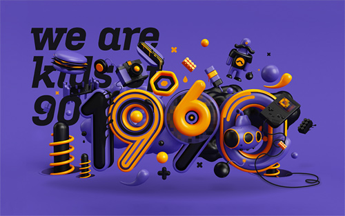
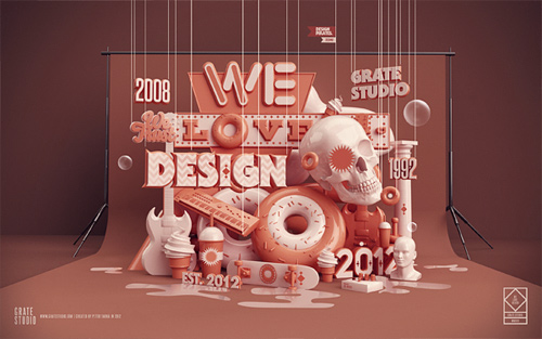
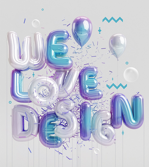
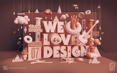
  不管是網頁設計還是平面設計工作,字體在其中都占有非常重要的地位,也許只是一兩個字,但不同的字體效果會大不相同。對於字體設計師來說,設計字體需要靈感和想象力,除此之外,你設計的字體還要融合自己的情感和經歷,只有這樣,你才能將自己想表達的東西通過字體傳達給用戶。

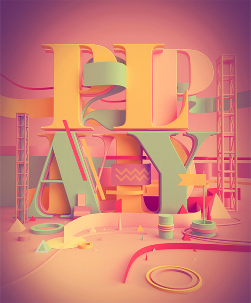
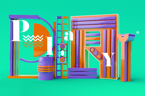
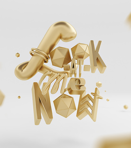
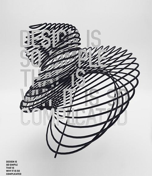
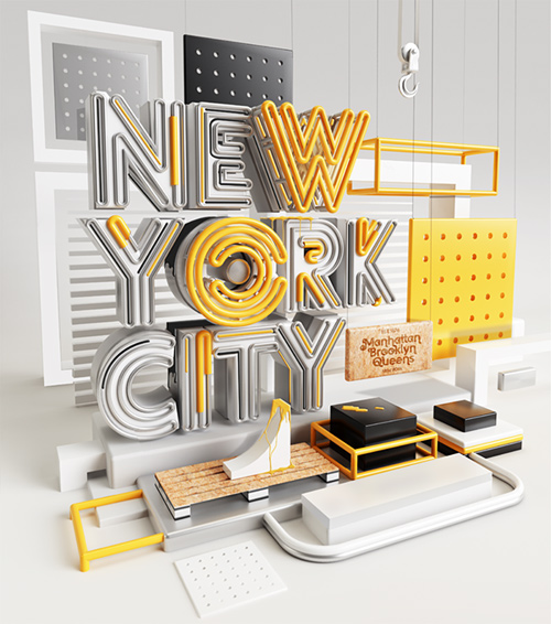
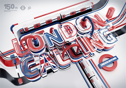
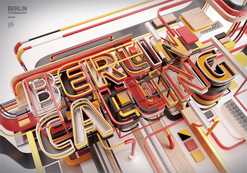
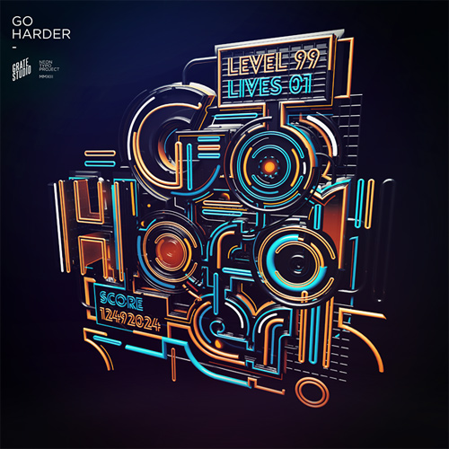
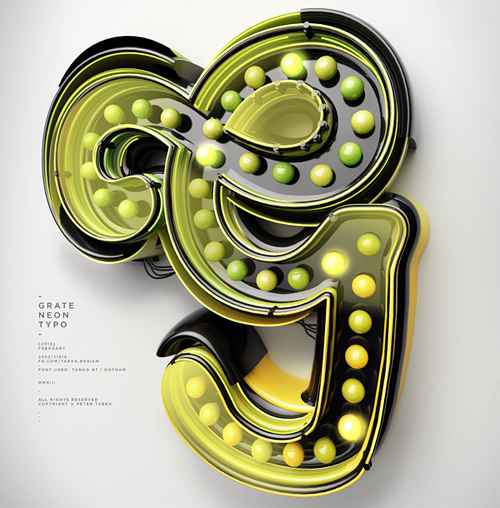
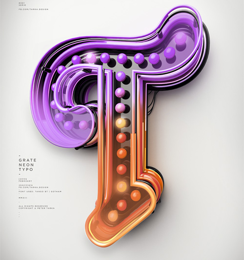
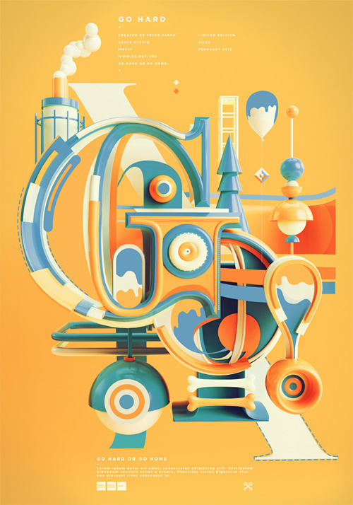
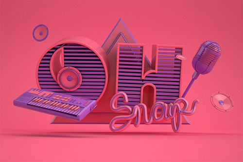
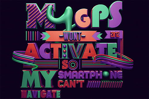
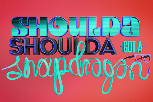
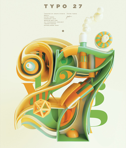
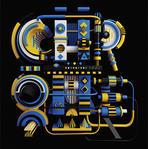
  今天我們將要介紹的一組字體來自波蘭插畫設計師Peter Tarka ,在插畫型字體方面他有著非一般的建樹。對於字體設計師來說,欣賞他的作品可是一道開胃菜呦~快來看看吧,欣賞然後吸收,希望有一天你的字體也能出現在這個版面!

那些年,我們一起追過的字體 三聯
peter tarka typography illustration
copyright © 萬盛學電腦網 all rights reserved